Illuminated Wisdom: Buddhist Calligraphy & Verse

by Ajahn Dhammadharo | Feb. 1, 2023

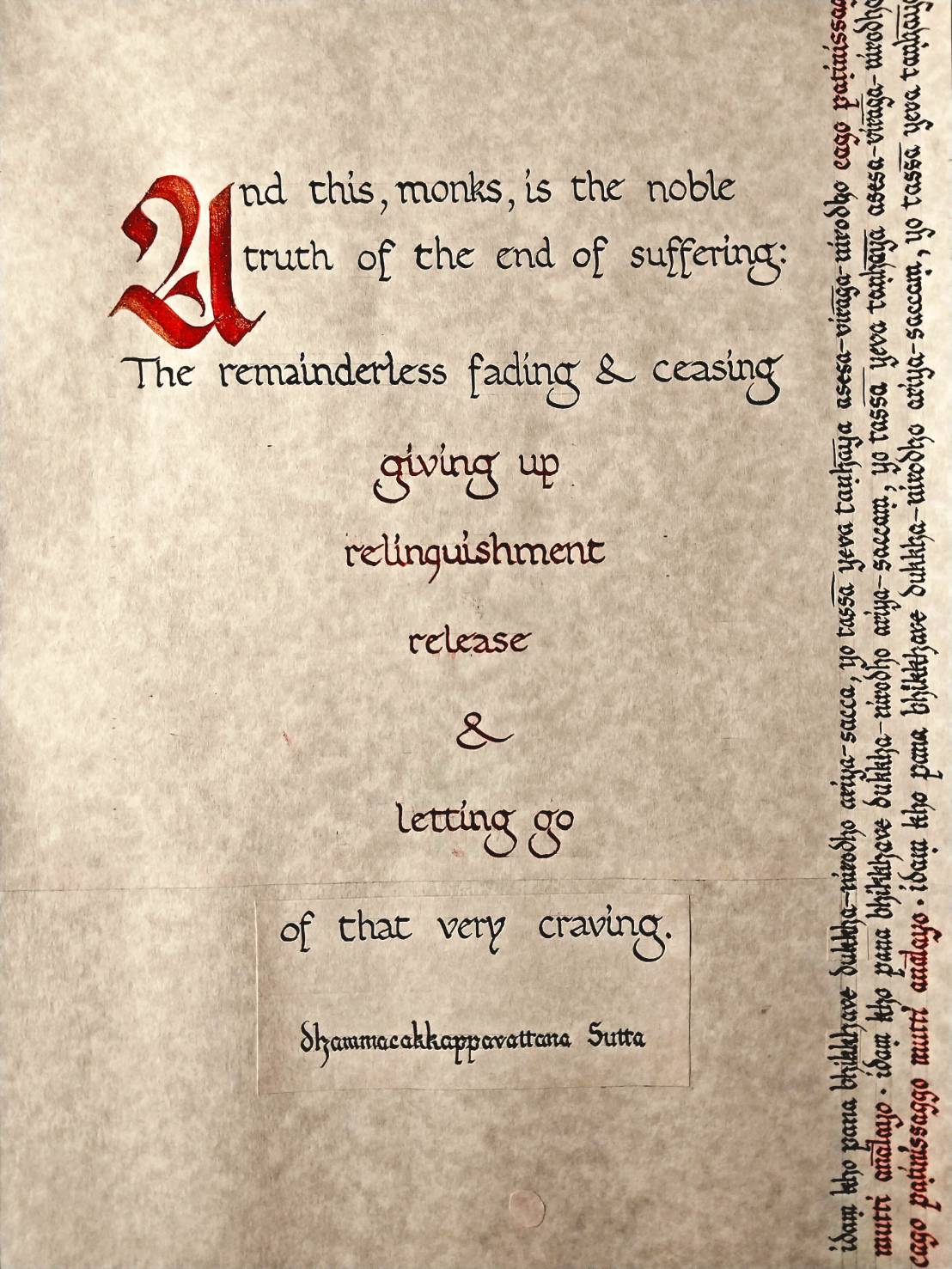
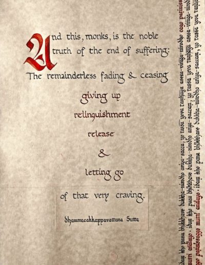
"Relinquishment"

This excerpt from the Dhammacakka Sutta (in particular, the sequence of verbs highlighted in red) struck me as the essence of Dhamma practice and thus worthy of calligraphing. The act of giving something up rather than taking possesion of it is central to the teachings, from the basic practice of generosity – the relinquishment of material goods – all the way through to the higher forms of relinquishment: the abandoning of all unwholesome states of delusion, conceit, and selfhood. The text running up the side of the page is the corresponding original Pali with the words for giving up, relinquishment, release, and letting go calligraphed in red.

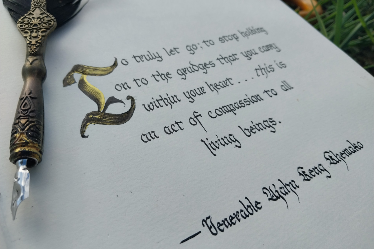
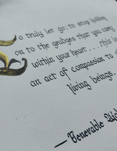
"Compassionate Letting Go"

This is a quote that Ven. Ajahn Keng once sent. I asked if I could edit it a little for readability, calligraph it, and share it. He gave his permission.

It was done with a quill and Japanese sumi ink in Fraktur script.

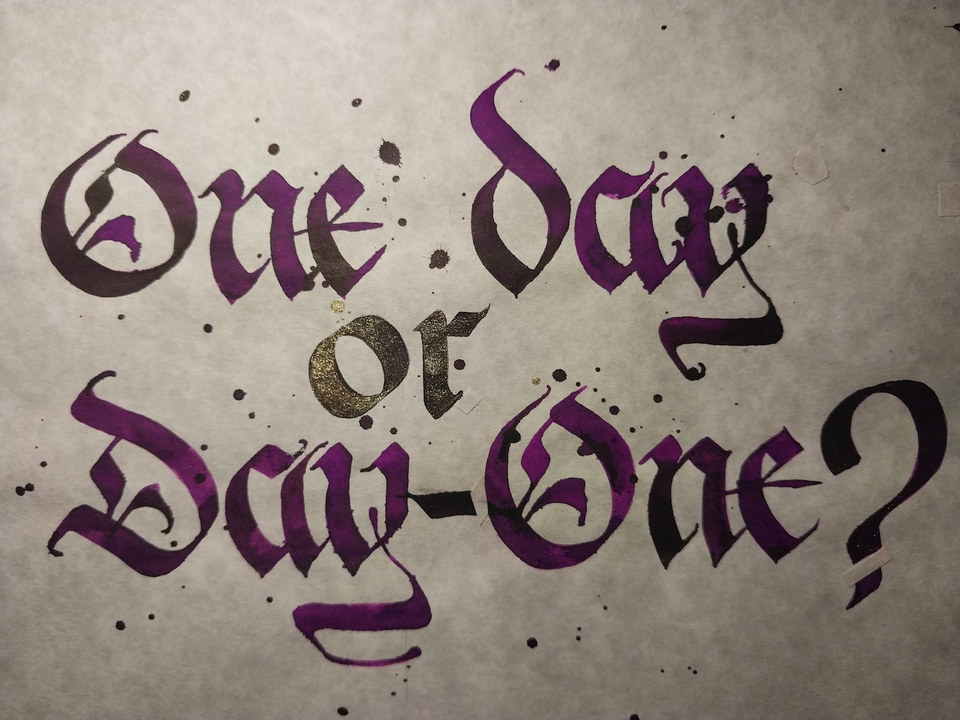
"One Day or Day One?"

I saw this line painted on a rock one day as I was walking through a forest in Co. Clare, Ireland. I understand it to be an encouragement to stop procrastinating and make today the first day of a pursuit that has been put off for too long.

The script is called Fraktur and it is done with a pilot parallel pen. The spots and drips are deliberate; a standard way of decorating a calligraphy piece.

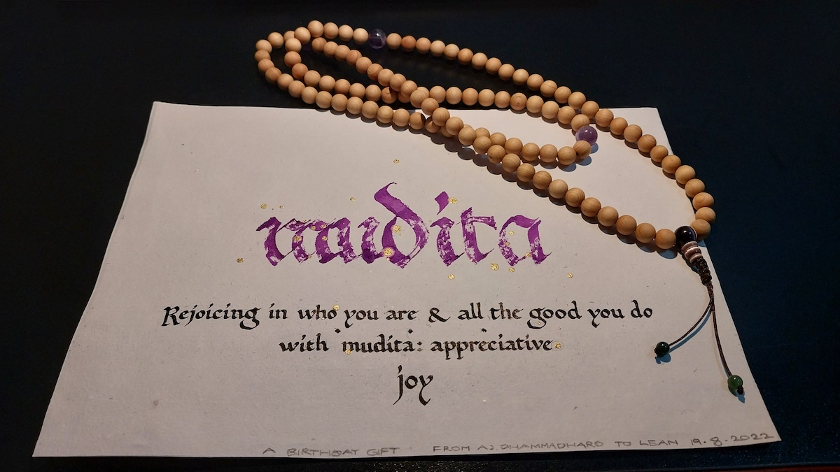
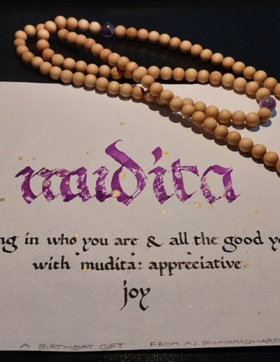
"Mudita"

This expression of mudita – the third of the four divine abiding places (brahma-vihara) – together with the beads were a birthday gift.

It was done with a quill and a pilot parallel pen on very thick, rough paper, hence the sketchy look on the purple lettering.

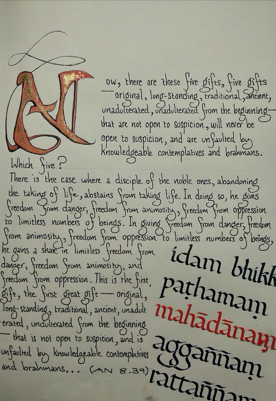
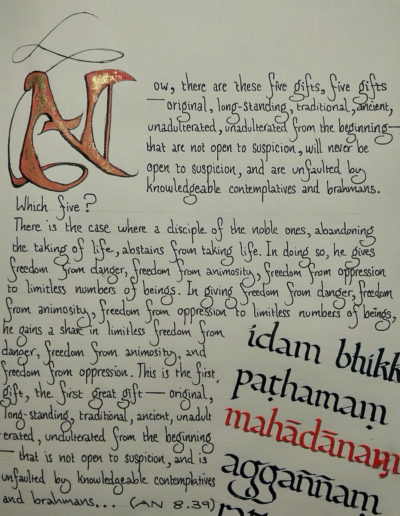
"Five Great Gifts" (AN 8.39)

This is my very first attempt at a complete piece. The capital dropcap N is not based on any particular script and neither is the body-text. The only part which is the result of calligraphy practice is the section of original Pali at the bottom with the key-term “maha-dana” (great-gift) calligraphed in red. This part is done in “foundational hand”.

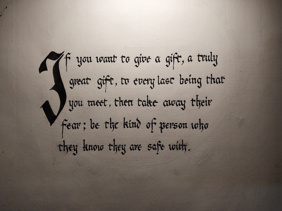
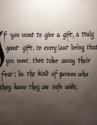
"The Gift of Safety"

This passage was inspired by the other one titled “Five Great Gifts”.
It is done with Japanese sumi ink and a quill on paper.

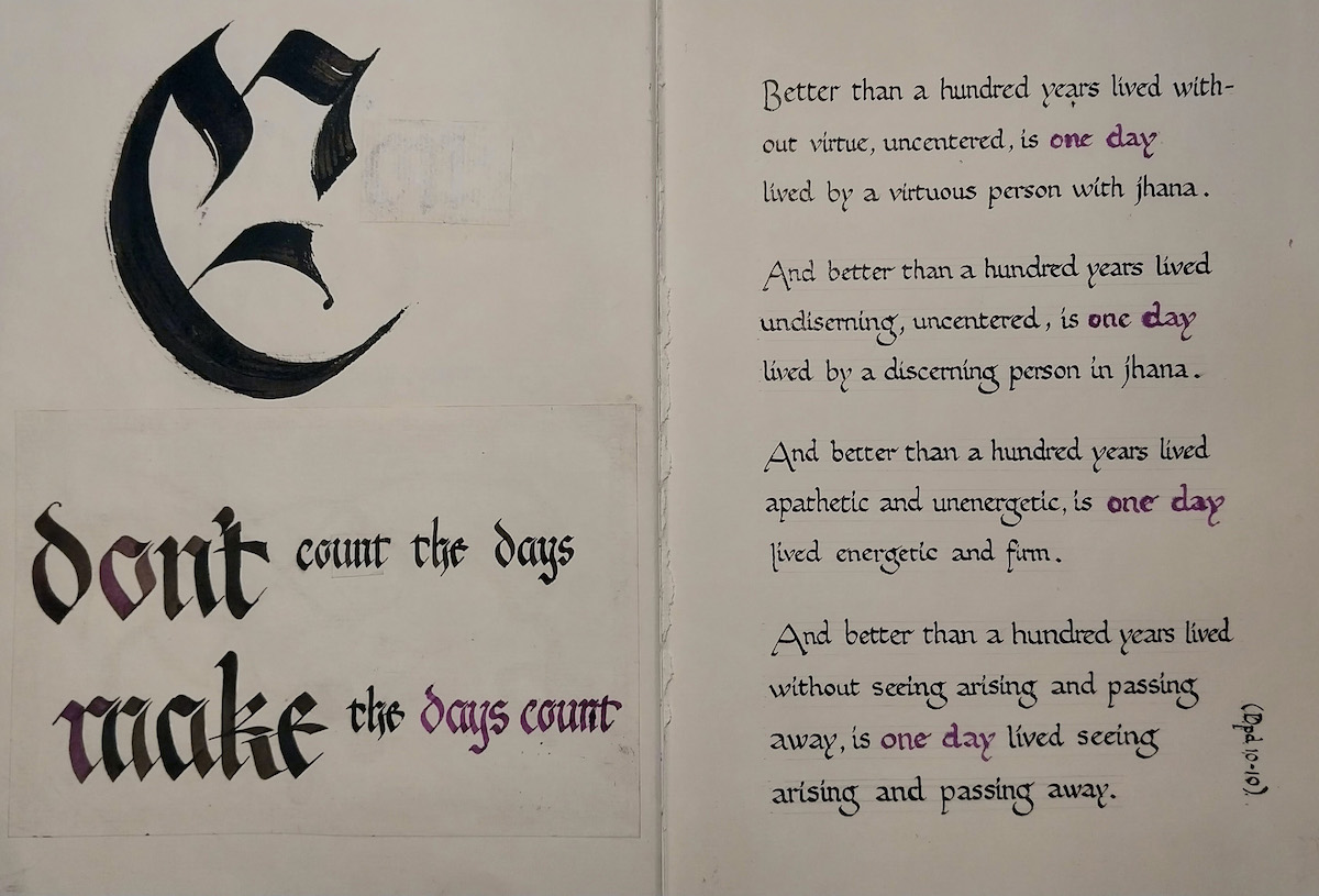
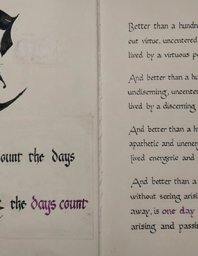
"Don't count the days; make the days count."

This is one of my very early attempts at a finished piece. The large black character on the top right is a letter C in Fraktur for “Count”. The lines beneath were written on a sign I saw walking into a country town on tudong many years ago. The verses on the next page are from the Dhammapada.

The Dhammapada verses are done with a quill and sumi ink. The larger letters on the left with pilot parallel pen loaded with black ink and then dipped in purple ink.

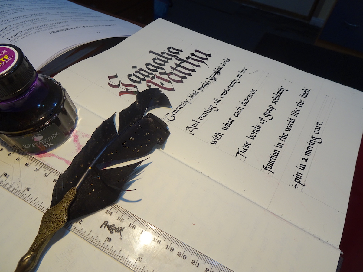
"The 4 Sangaha-Vatthu"

This is a canonical verse on the four grounds for group strength and harmony. It is a less than perfect piece, complete with two tragically smudged words in the first line and ruled, grey-lead guidelines which still haven’t been rubbed out. But this gives you a window into how much care has to be taken in the preparation of a calligrphy piece – the layout, spacing, ruling of guidelines. And also the focus that has to be kept up throughout the whole process. It’s very easy to screw it up and you can’t just highlight and hit the delete key when you do!

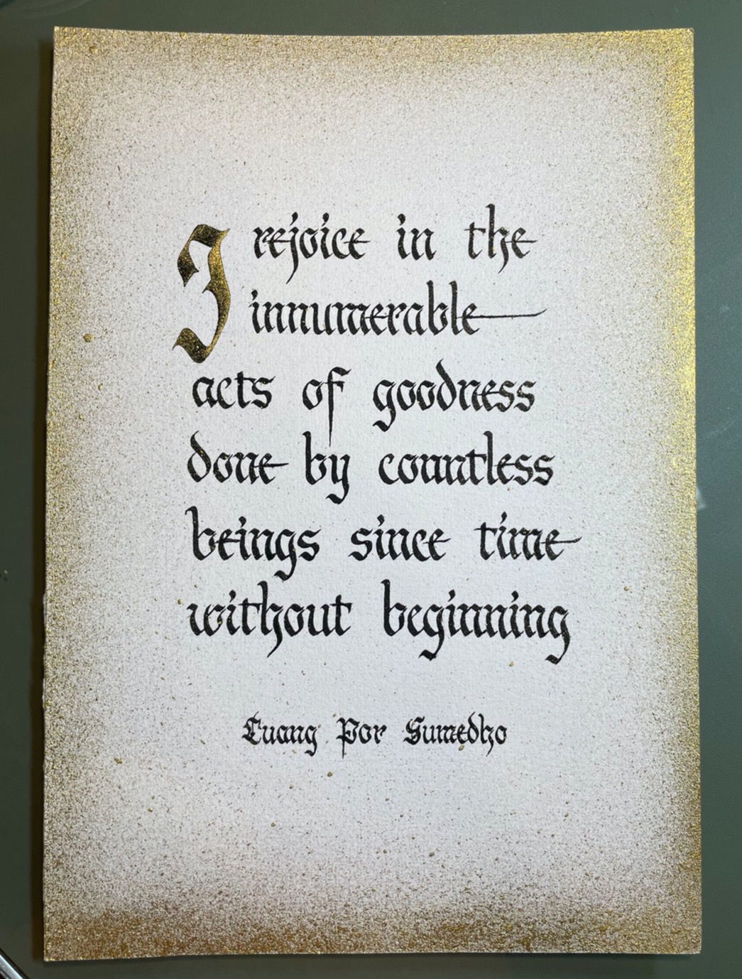
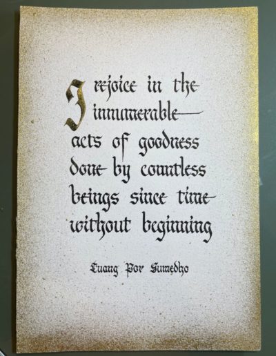
"Luang Por Rejoicing"

This is a reflection that I found penned on a piece of paper on Luang Por’s desk one day when I was cleaning his kuti. Ajahn Asoko since requested me to calligraph it. I offered this particular version to Luang Por once it was finished.

I think both the profundity of Luang Por’s spirit and the breadth of his mind come through in this statement, which affords us a small glimpse at the human realm through the eyes of someone who sees and truly appreciates the goodness in us all.

This version was done with black and gold ink in Fraktur script. The gold spray-effect around the edges is achieved by flicking the head of a toothbrush dipped in gold paint around the sides of the paper.

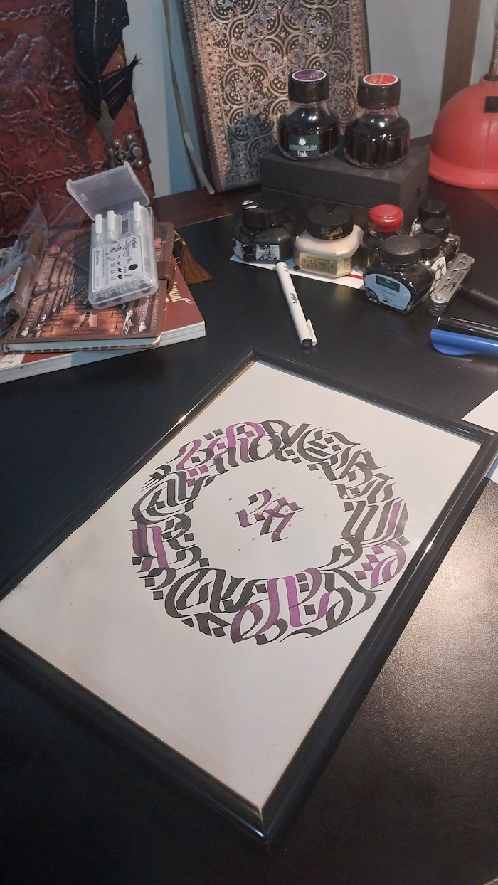
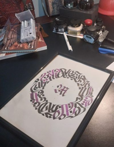
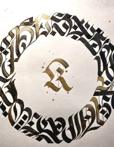
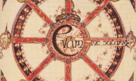
"Metta Mandala"

A mandala using black and purple. The character in the middle is an “M” for Metta – Friendliness or good will. I chose to use purple because purple strikes me as resonant with the quality of metta.

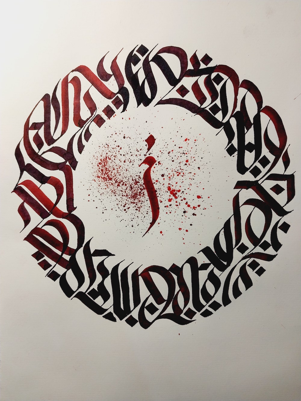
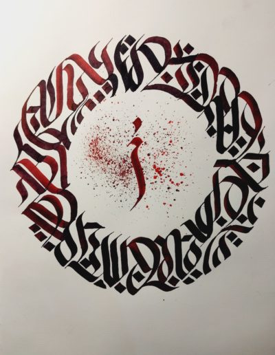
"Mandala, the Second"

Another second mandala piece.

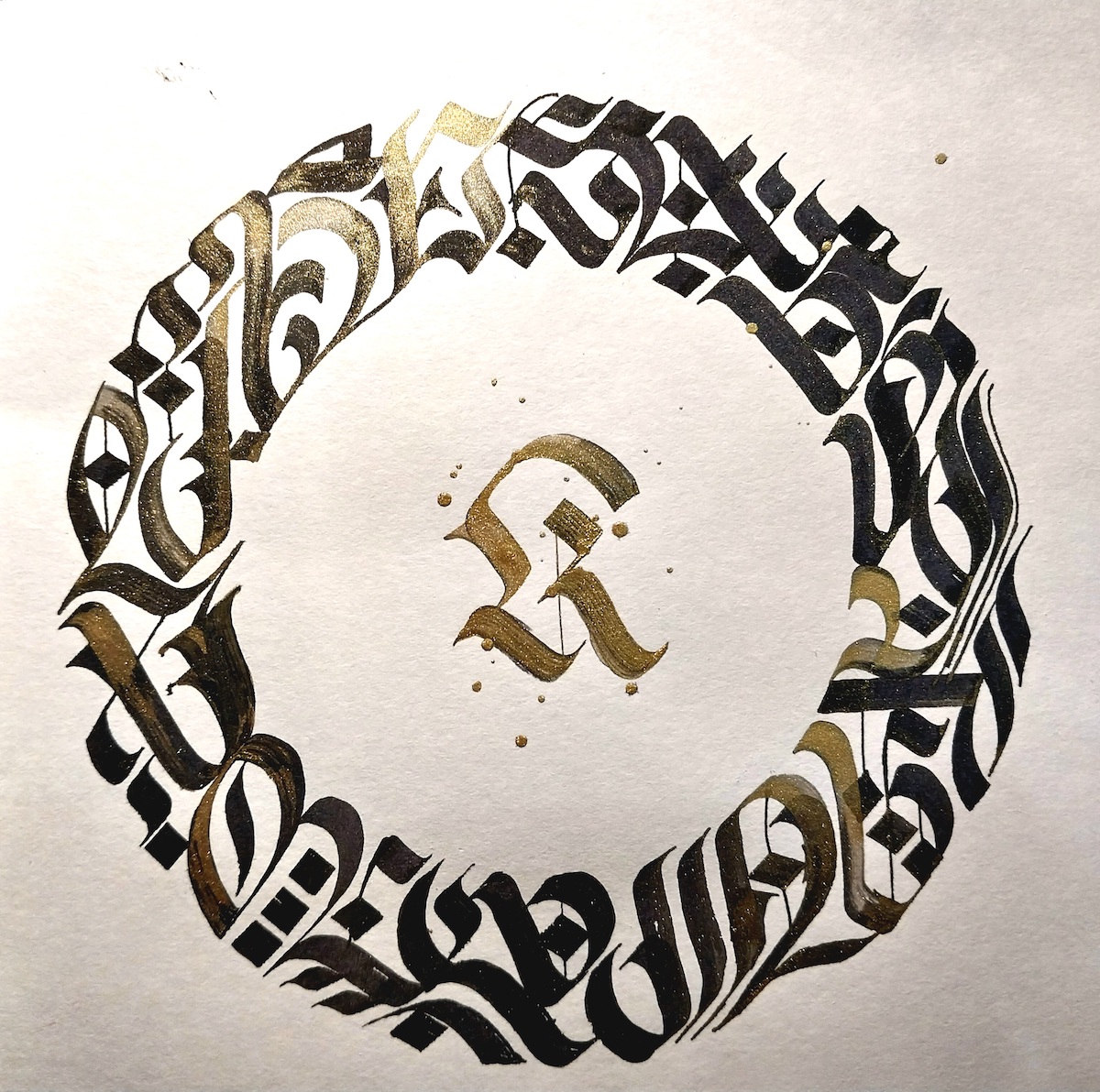
"Mandala, the third"

…and a third.

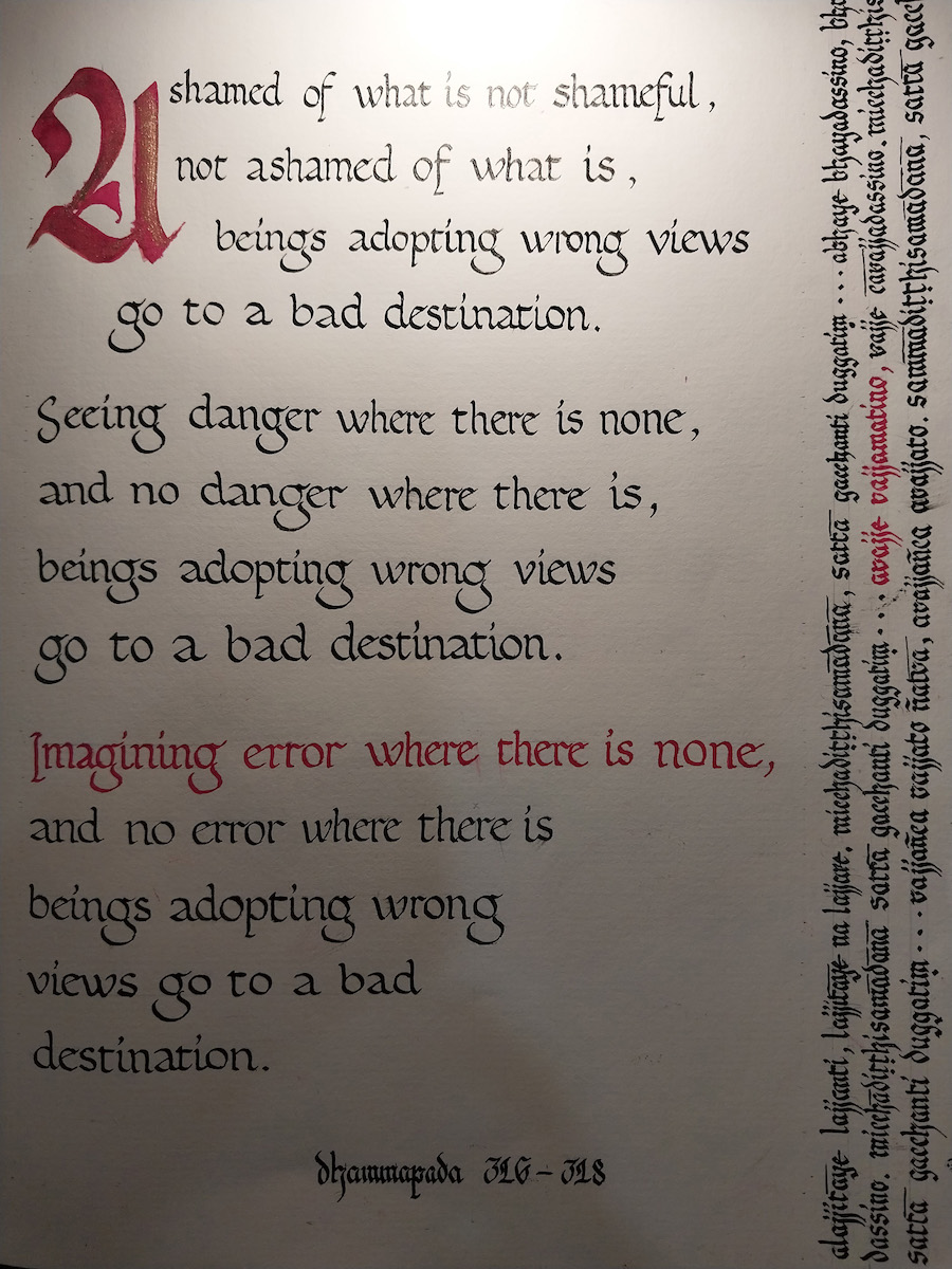
"Correct Shame"

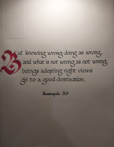
The line “Imagining error where there is none” is highlighted because I felt it was so relevant to a common problem with Western Buddhist practitioners: misguided guilt and the inner tyrant of self-criticism. This verse is an encouragent to pratice morality with a judicious rather than judgemental attitude, as one monk once put it to me. It encourages us not to exagerate the little mistakes and not to go into denial about genuine faults that we need to work on. It simply asks us to combine morality with peace of mind and discernment.

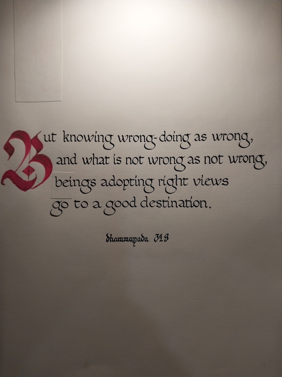
"Correct shame, the Second"

The happy ending: When a person is clear-eyed enough to understand what is what and proceed accordingly.

You’ll notice some patch-work here; the painful part of calligrahy is that one slip of mindfulness – or an inky hand – can cost you dearly. In this case I decided to patch it rather than insist on perfecton and start again.

On Calligraphy

There is an old Thai maxim: “To inscribe one letter of Dhamma is equal in value to casting one statue of the Buddha.” We could interpret the word “inscribe” as an aged version of what might now be better—and more conveniently—interpreted as “write”. But the word used in the original Thai—jah-reuk—does literally mean “inscribe”. And it’s worth noting that to inscribe something is quite a different experience to writing. It takes much more patience, effort, attention to detail, and mindfulness—in a nut shell, much more care—than just jotting or typing.

And I’m not the only one to note that there is something more evocative and moving in the reading experience when words are written in someone’s own hand compared to what is generated by technology or automated by type-faces. It probably makes us feel that bit closer to the person behind the words; like what they are sharing with us is somehow more personal and authentic. This is because a person’s handwritten words are a direct and physical continuation of their own hand onto the page, with no artificial or digital tools between us and the writer. And surely, the potency of this can increase dramatically when the words are calligraphed.

Calligraphy is a three-way intersection where writing, art, and wisdom meet and converge in a single discipline. This discipline or artform is one for people who love words with depth. Maybe this is the underlying reason why spiritual traditions, both East and West, have shared this practice through the ages; why people from many different countries have been recording their teachings through the scribal arts for thousands of years: They all feel a need to highlight and share their message with their quills, pens, and brushes in a way that makes it clear to the reader that these words are important. When scribes and calligraphers take the time to do what they do, the importance they are giving certain words is visible, sometimes almost mesmerizingly so.

Something which is striking is the uncanny and longstanding connection between the pen and the robe. In Europe, it dates back at least as far as 6th century where the scriptorium, often a wing of the monastery library, was historically a place where you would find monks copying out texts, calligraphing and illuminating manuscripts, binding, and archiving. In short, the craft of book-creation. (And as many would already be aware, calligraphy is not unique to the Christian monastic movements; a tradition of calligraphy is also found in Mahayana and Zen Buddhism.)

If it is straight Dhamma that I am doing—either from the Buddha or from any other Dhamma teacher—I use a script called “foundational hand” as it is clear and easy to read; I avoid embellishment or too much decorative element in the main text of a passage of Dhamma as it may render it illegible for some or distract attention from the meaning of the words. For Pali words I use what is called “Fraktur miniscule script” as it has an archaic edge to it—fitting for an ancient language, I think—but also quite clear and easy to read. For miscellaneous passages, quotes, or single words, I permit myself more creative flare.

Words have their limitations; they can only convey so much. But they they can still convey a lot. And when deployed with skill they can be very powerful. I hope some inspiration can be found in these ones.

– Ajahn Dhammadharo